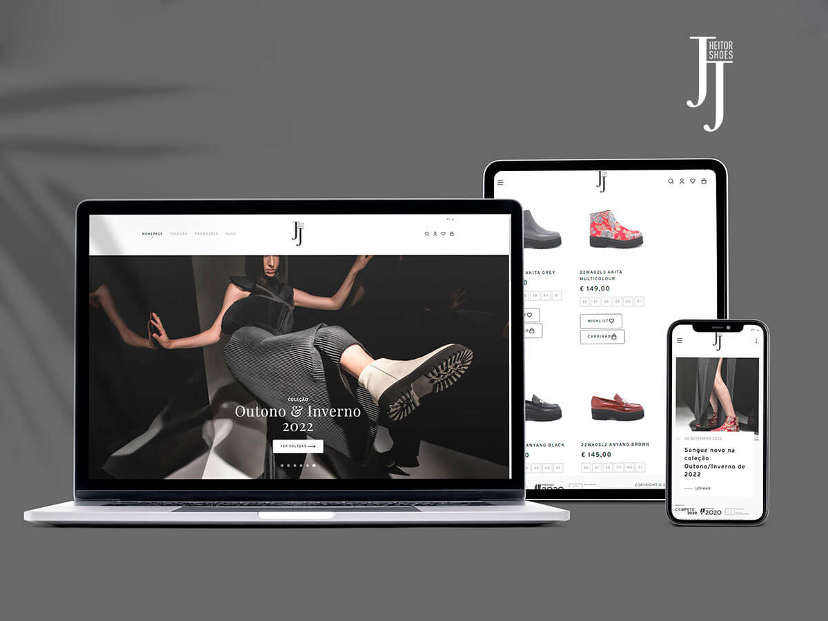
The main premise of the jjheitorshoes.com website redesign was modernization, not only technological, but also in terms of aesthetics. Looking at the user experience, we sought to create more standardized navigation flows, with easy and intuitive navigation, which would respond effectively to different screen sizes.
Regarding the visual component (User Interface), we opted for a minimalist and elegant design, highlighting the content itself. These were designed in an Atomic Design logic, aiming to create a Design System with a coherent visual language, from the smallest to the most complex elements.

