
UX rules for forms on websites
A form developed based on the rules that we will present below will definitely help for a better e-commerce conversion rate for your website.
UX rules for forms may seem a little basic to some, but unfortunately there are few Portuguese sites that comply with them properly.
A form that is too long, complex or incomprehensible to users, usually leads to the abandonment of the purchase process.
The more input fields you have, the lower the conversion rate. Thus, any investment made in acquiring visits may not be profitable at all – which is why we must place great importance on the steps of the conversion funnel in general, and the forms present in them in particular.
The list of rules below will help you to optimize your forms and increase your conversion rate.
Rule #1: Keep it simple
It is important that the conversion process is as natural as possible for the user. Rule number one: ask only for pertinent information. Forget additional non-mandatory information “already” and “now”. Do not make the form long as it may alienate the user. Just ask for the essentials.
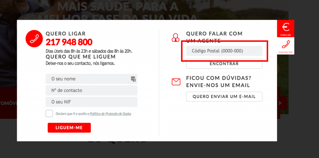
Rule #2: Ensure the correct data type in the input fields
Show examples in the form fields.
A trivial “0000-000” in the postal code field (if it is not separated by two separate fields) indicates to the user that it is necessary to separate the digits with a hyphen and helps to avoid errors such as “1900 100” or “1900100”.
The format may seem too obvious to you, but ordinary users can be confused. And this is the last sensation that we want to awaken in users during the moment of conversion.
Another example is the input fields for phone numbers, which should have a mask like the example “+351 ___ ___ ___”.
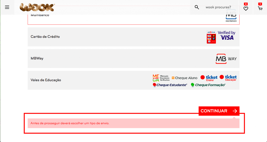
Another crucial point in UX rules for forms is error messages.
Whenever the user fills out the form and clicks on “submit”, the form must be validated on the side of the site. If the data entered is different than expected, the form is not sent to the server and a message explaining the error is presented to the user. The situation when the form is not validated at all, and is sent “as is” to the collective mailbox, is considered an error.
Now, about the visual indications of errors in the forms.
In addition to highlighting the input fields that generated submission errors (usually using red color), it is considered a good tone to present the user with a very brief and simple explanatory message saying what went wrong, so that they know how to correct it then.
Rule #3: Save the entered data
There are cases where the user fills out a long and exhaustive form for a few minutes. When you click on “submit” a submission error occurs: the page is automatically updated and all data filled in by the user disappears. He is obliged to fill everything again!
It is a huge disrespect for users and, at the same time, the best way to scare them in relation to the conversion process.
The solution is to cache all the information entered by the user in the forms, and not just that which has already passed validation and was successfully submitted. When an error occurs, we can simply highlight the fields incorrectly filled in, but with the information submitted, avoiding additional filling in by a furious user.
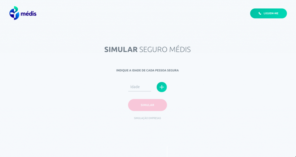
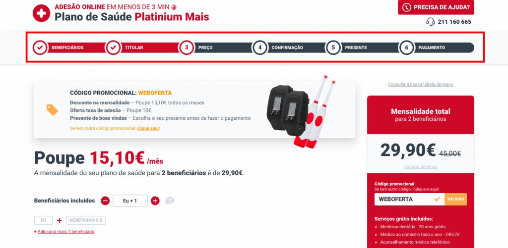
Rule #4: Visible progress of steps
The user must always know the step he is currently on and how many steps he still needs to complete to reach the desired goal.
A visual indication of progress is the perfect solution to this problem. It is considered normal to decompose the conversion form into four or five steps, grouped logically.
For example, in the case of an online store:
- in the first step we ask for general information about the customer (name, phone number, TIN, etc.),
- in the second, we ask for the billing and delivery address,
- in the third, we give the choice of payment method,
- and in the fourth, we present the summary with the order data, address and payment method chosen.
The user checks the order information and confirms the transaction.
Simple.
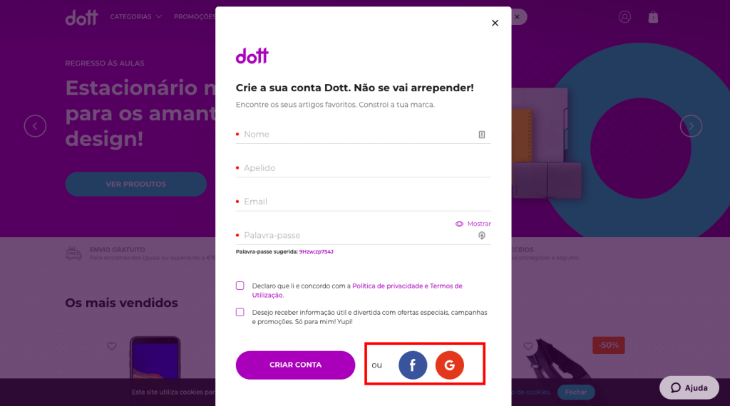
Rule #5: Checkout without registration
Checkout must also be available to unregistered users.
Registration is another procedure that we are including within the conversion process. We remind you that the more steps the conversion takes, as a general rule, the less likely the user is to reach the end.
If, even so, you need to have the user registered because the business rules require it, make registration as simple and quick as possible, such as registration with just one click – registration through social media logins, for example.
Rule #6: Anti-spam protection
The most popular option is to ask the user to enter alphanumeric characters, shown as an image, in a specific field.
This feature is called CAPTCHA.
At first glance, it is a good option. However, the analyzes made show that this type of solution actually distances users. Currently, there are already many technological solutions, such as the “invisible captcha”, which allow users to block spambots effortlessly.
Rule #7: Data protection and GDPR
Currently, it is necessary to request the user’s consent for the processing of personal data, in accordance with European GDPR law. The absence of consent is punishable by a fine starting at € 1,000 (for SMEs).
In addition, today, users are increasingly careful about sharing their personal data. Thus, the request for consent must be present and clearly visible on the form; otherwise, it loses in the conversion rate and may still be punishable by law.
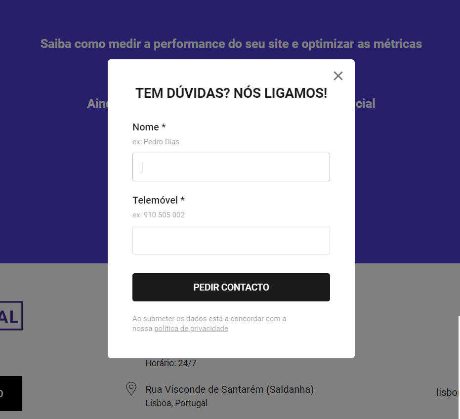
UX rules for Contact forms
The rules described above also apply to the contact’s request forms (click-to-call). However, for this type of forms, there are also specific rules:
- No pop-ups that appear automatically on the screen (with or without a scroll trigger). In addition to having a negative impact on the user, our experience says that they generate virtually no conversion. This rule also applies to click to chat.
- No animations within the popups: bouncing buttons, elements that blink, interfere with the perception of information on the page itself.
- The form must have its own title and the fields must be well marked. The user must easily understand what the popup is about, what data needs to be filled in and what is the next step.
Conclusion
The creation of an order and feedback form has some rules that must be followed, but that are not a seven-headed bug. Use our experience presented above on UX rules for forms to improve the flow of the conversion funnel on your website or company.
Article written by Ivan Panchenko – Web Analytics Specialist
Header photo credits: Hal Gatewood on Unsplash
Also check out:
Increasing online sales: examples of lead magnets in the conversion funnel